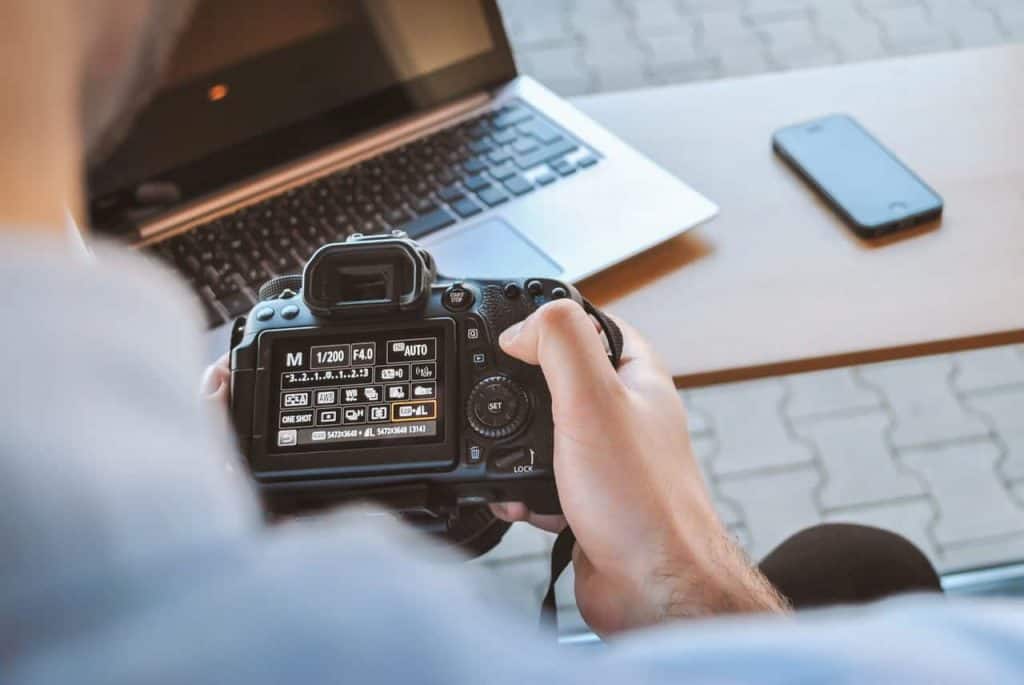
When designing a web page, the use of photos can make all the difference. There are a few things you need to keep in mind, though. Make sure you're using high-quality pictures. It makes you look more professional. If you have to resize a picture, always try to scale down. Enlarging a picture often decreases the quality. Bigger pictures are better, the ideal picture-to-page ratio is about 40% picture to 60% page. When taking a picture, remember the rule of thirds, dividing your picture into 9 equal sections and placing your subject along with the points of the intersecting lines. It is also good to have a lot of white space around your subject, helping to draw the viewer to them. If you want to shake it up, choose non-traditional angles.
Key Takeaways:
Careful editing and image positioning makes a greater impression on people who are viewing an image.
Use high-resolution photos and avoid small image formats, also position eyes to fall on intersection points of 3×3 grid.
Make sure to leave empty space around the subject as it helps in defining the subject of the photo. Don't fear breaking rules and be creative.
“Photos and graphics tell your organization’s story in a way that text alone cannot.”
Claim Your Free Non-Profit Marketing Blueprint
Read more: https://www.classy.org/blog/5-killer-photography-tips-for-nonprofit-brands/


