You want your website to look great on every screen, load fast on mobile, and convert across devices. Responsive web design helps you do exactly that with one adaptable experience.
In this guide, you learn what responsive web design is, why it matters for your brand and customers, and how you implement, optimize, and test it with confidence.
You also get practical steps, real-world tips, common pitfalls, and snackable FAQs so you can take action right away without guesswork.
What Does Responsive Web Design Mean
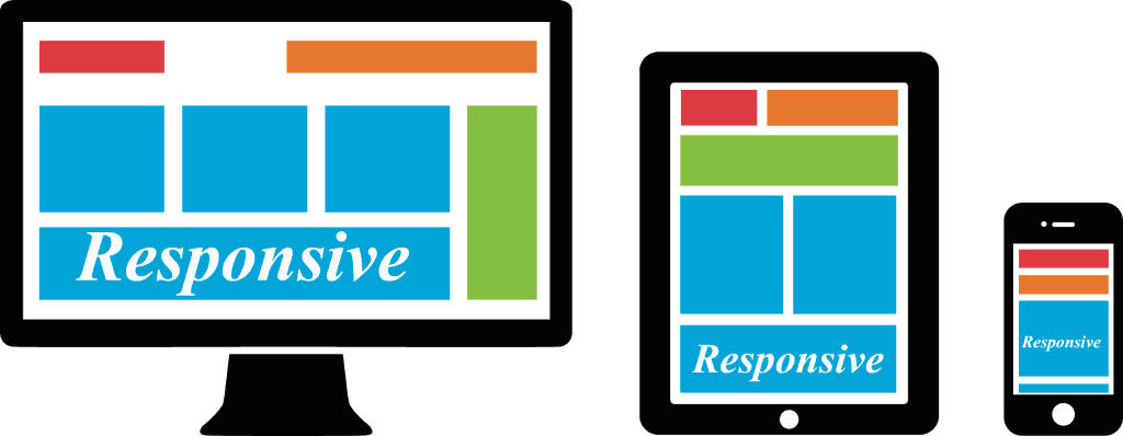
Responsive web design means you deliver one flexible site that adapts layout, images, and typography to the viewport based on screen size and device capabilities.
Using CSS, fluid grids, and mobile-first media queries, you serve the same content in a readable, accessible format without zooming or sideways scrolling, which boosts usability and conversions.
In the U.S., mobile drives over half of web traffic, so you plan for small screens first and progressively enhance for wider devices to cover the majority of sessions efficiently.
How Does Responsive Design Influence Trust and Perception
Your interface signals quality at a glance. If elements overflow on a small device or text feels cramped, you lose trust and increase bounce—research consistently links clarity to double-digit conversion lifts.
Even small friction raises exit rates; when you align content to the screen, you remove errors and hesitation, which helps you earn credibility during first impressions that form in milliseconds.
Tip: keep interactive targets at least 44px and maintain generous spacing around controls so thumbs tap confidently on crowded mobile screens.
How Does Responsive Web Design Boost SEO and Performance
Google favors mobile-friendly pages, and responsive web design consolidates your URLs, which simplifies crawling, indexing, and sharing across devices.
Because 53% of mobile users abandon slow pages, you compress images, defer noncritical scripts, and reduce layout shifts to improve Core Web Vitals. Aim for LCP under 2.5s, CLS under 0.1, and INP under 200ms for strong rankings and happier users.
- Use srcset and sizes so images scale to different screens without sending unnecessary bytes.
- Set max-width: 100% on images to prevent overflow and preserve layout stability.
- Minify CSS and inline critical rules to speed first paint and improve perceived performance.
How Can Responsive Design Drive ROI for Your Business
By maintaining one codebase for all devices, you cut development time, reduce defects, and focus resources on features that move revenue metrics instead of duplicating effort.
For example, when you streamline checkout on small screens, you can reduce form completion time by about 30% and lift conversions with autofill, clear labels, and fewer steps.
You track outcomes by device and viewport width to prove ROI to stakeholders, linking faster pages and cleaner flows to conversion rate, AOV, and lower support costs.
What Mistakes to Avoid With Responsive Design
Common pitfalls are easy to spot when you look for rigid widths, hidden content, and heavy media that slows the page—images often account for the majority of page weight.
- Using fixed-width elements; prefer percentage widths and flexible grid columns.
- Forgetting the viewport meta tag, which forces zooming and tiny text.
- Loading uncompressed images; serve modern formats and responsive images.
- Blocking taps with crowded controls; add spacing and 44px targets.
In testing, simplifying navigation labels can reduce errors by measurable percentages and shorten time to task completion, which improves session quality.
Steps to Create a Responsive Website
- Define content priorities for mobile, then expand the layout for larger screens with progressive enhancement.
- Add the viewport meta tag so the browser matches device size and scales content correctly.
- Build a fluid grid with CSS Grid or Flexbox and use gap for spacing to avoid brittle margins.
- Write mobile-first media queries and adjust columns, images, and text sizes as breakpoints require.
- Compress media, lazy-load offscreen images, and test on real devices to validate performance.
What to Know About Media Queries, Grid, and Flexbox
Media queries apply CSS based on features like width and orientation, while CSS Grid and Flexbox control layout structure, alignment, and reflow under constraints.
Example: you switch a three-card grid to a single column under 640px and scale images with max-width so elements remain readable and stable during resize.
Tip: prefer container queries so components adapt to their parent size; modern browsers now support them, which reduces awkward global breakpoints.
How to Test Across Devices and Browsers
You simulate screens in DevTools, but you also test on real hardware and monitor Core Web Vitals in Search Console and analytics to catch issues early.
- Review device mix and top viewport sizes from analytics so you optimize where traffic concentrates.
- Run Lighthouse audits and fix regressions before they reach users, tracking scores over time.
- Check accessibility: contrast, focus states, labels, and keyboard support to meet WCAG guidance.
FAQs
How do you choose breakpoints?
You set breakpoints where your layout needs changes based on content flow, not by chasing specific device sizes, which shift over time.
What is the viewport meta tag for?
You tell the browser to match device width and scale content appropriately so text remains legible without zooming on small screens.
Should you use Bootstrap or Tailwind CSS?
You can prototype faster with a framework, but you remove unused CSS and customize tokens to avoid bloat and improve performance.
How do responsive images work?
You provide multiple image sources with srcset and sizes, and the browser picks the best fit for the current viewport and pixel density.
Can you make responsive text without media queries?
You use clamp to scale font sizes between limits based on viewport width, which maintains readability and avoids oversized headings.
Key Takeaways
- Design mobile first: start from small screens, focus content and core features, then enhance the layout for larger sizes so users get readable pages across different devices and viewports.
- Set the viewport meta tag: instruct the browser to match the device width and scale content, preventing tiny text and sideways scrolling for your users on mobile screens today.
- Use fluid grids and Flexbox or CSS Grid: percentages, gap, and minmax help elements scale cleanly, while max-width on images ensures layout does not overflow at smaller sizes reliably.
- Write mobile-first media queries: begin with a solid base and add min-width rules when the design needs adjustments, keeping code maintainable and performance strong as screens get wider progressively.
- Optimize media: compress images, serve WebP or AVIF, lazy-load below the fold, and limit autoplay video so your pages load quickly and provide a smoother user experience on mobile connections.
- Protect ROI: one responsive website reduces duplicated work across devices, lowers maintenance costs, and improves conversion when forms are simpler, targets are larger, and content is prioritized for mobile journeys.
- Test thoroughly: review analytics for top viewport sizes, run Lighthouse, monitor Core Web Vitals, and validate accessibility so users can navigate content with keyboard, assistive tech, and touch across browsers.
- Keep improving: iterate from real user feedback, simplify navigation labels, measure bounce rate by screen size, and prioritize fixes that reduce layout shifts, speed rendering, and build trust over time.
If your responsive experience isn’t driving results, it may be time to rethink your layout, performance budget, and testing approach. Start improving your responsive web design today. Call Strategic Websites to help you strengthen your UX for long-term success.