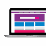
You can optimize your site with mobile first design. When you begin your design with mobile users in mind, then you are starting with a mobile first design. It might seem a bit strange, but when you are making a site, you need to think about how it will look on a very small screen size. After that, you should work towards higher screen sizes. If your website works well on a smart phone, then it will likely work well on a larger screen too.
Key Takeaways:
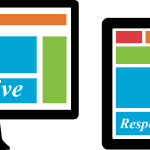
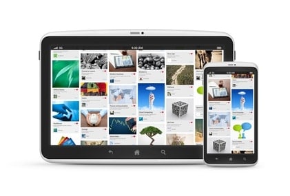
Sites designed for smart phones will still look good on laptops and larger screens, but not visa versa
Sites need to have all options easily accessible so that users on a small screen can easily find the content you want them to
Large font and large buttons even on a small screen are better for customers so they can use your site
“With about 2 billion smartphone users worldwide, if your website doesn’t perform well across devices, you’re missing a pretty huge chunk of potential business.”
Read more: http://designrfix.com/web-design/optimizing-site-mobilefirst-design