
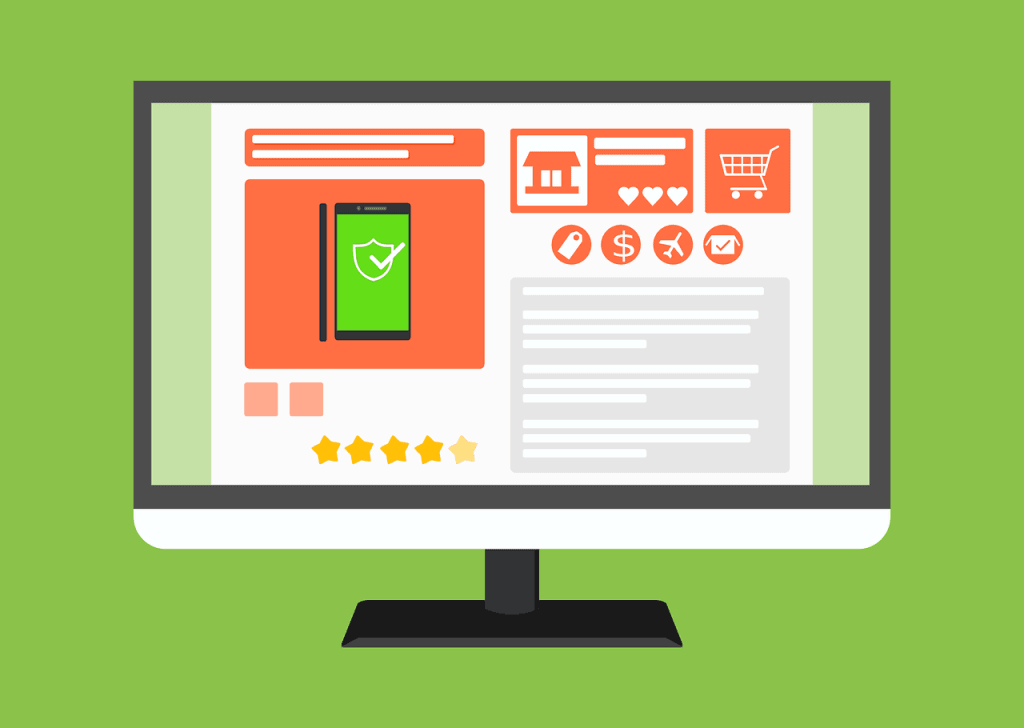
This author takes you on a journey to help you understand the building blocks to the perfect E-commerce page you can make. First being an easy task of making sure at the top of your page to simply have navigation. Next, have your important products displayed in center, keep it easy and visual. Last make the checkout easily in sight and available to the client.
Key Takeaways:
You need to know where, broadly, you can go in the website. Where can I explore from here? If this is my first visit or if this is my second visit and I'm trying to learn a little bit more about the company, I want to be able to easily get to places like About, or I want to be able to easily learn more about their products or what they do, learn more about the potential solutions, learn more about their collections and what other things they offer me.
About 10% to 12% of visitors on average to ecommerce pages will use Search as their primary navigation function. So if you make that really subtle or hard to find or difficult to use, the Search feature can really limit the impact that you can have with that group.
Naming convention. We want price. We want core structural details. I like that Bellroy here has made their core content very, very slim, just the photos, the name, and the price.
“We're just talking about a photo of the wallet itself, and then you can click left or right, or I think sometimes it auto-scrolls as well on desktop but not mobile.”
https://moz.com/blog/how-to-craft-the-best-damn-ecommerce-page-on-the-web-whiteboard-friday