
Whether you are creating a newsletter, flyer, email or social media content, typography will always be a factor. Typography is the style and appearance of printed matter. The font is the “file” itself, and the “type” is the letter's design. Below are examples of different fonts.

Here's how we recommend using them:
Serif- these are your more traditional font. The “feet” or “wings” help the reader move from letter to letter for an easy read. Serif is a great font for printed content.
Sans Serif- these are a more modern font. There aren't any “feet” or “wings” because it is easier to read on a screen without. This font is widely seen on websites.
Slab Serif- these fonts are more traditional, but now are used as display text. These are chunky with footers. Creating something bold to catch your eye. These are seen in both print and screens.
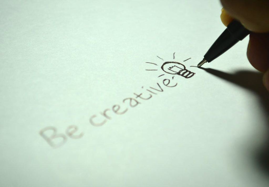
Handwriting- these are the fonts that are fairly new and used to add authenticity. It keeps your pieces visually appealing. These should be used on printed flyers, or headlines.